
Overview
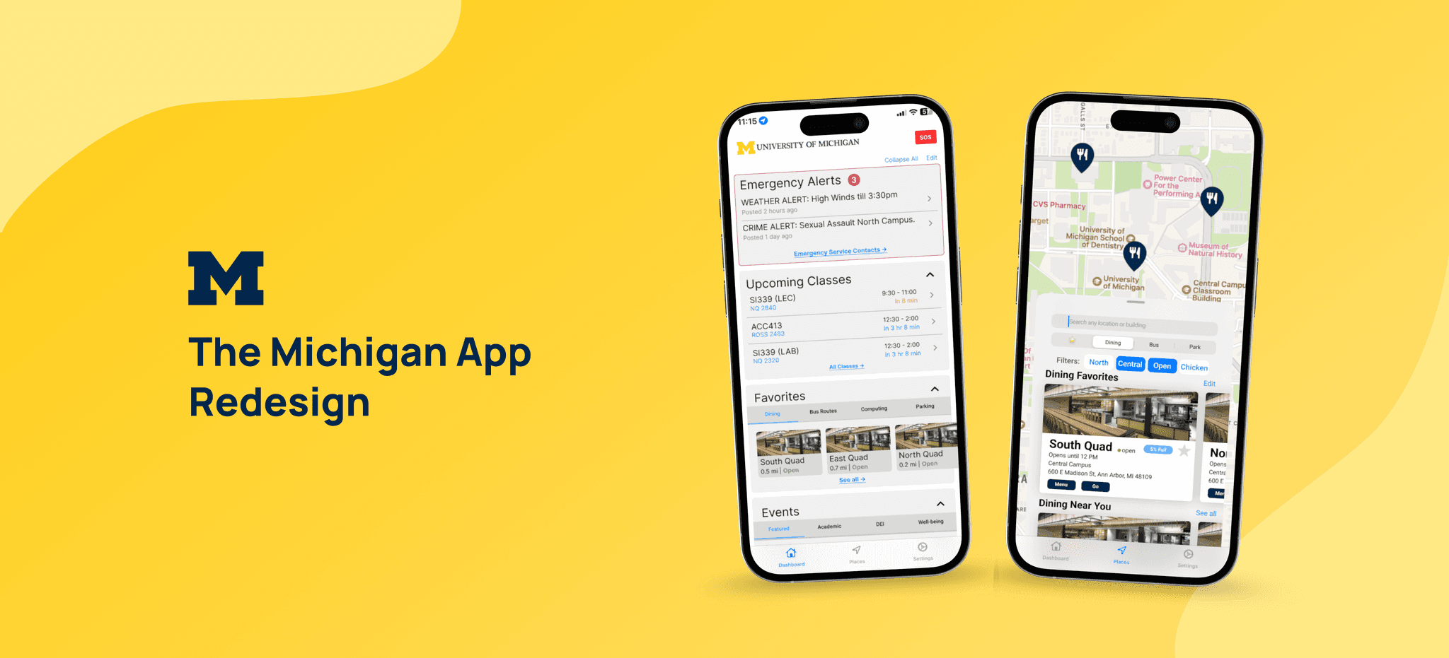
Improving Campus Navigation and Access for 26,000+ Users
During my 3-month internship at the University of Michigan (May–Aug 2023), I collaborated with the UX team to redesign the Michigan App, which brings together class schedules, transit, dining, parking, and events. Together, we researched how people used the app, identified key pain points, and developed a smoother, more scalable design that simplified navigation, improved engagement, and created a more connected campus experience.
Timeframe
My Role
Team
Project Link
Key Results
• Designed a modular, developer-friendly system to reduce complexity and costs
• Presented to university executives and secured support for implementation
• Redesign approved and now being integrated into the live Michigan App


Problem & Goal
Simplifying Campus Life in One Tap
The Michigan App was designed to be a one-stop hub for campus life, offering everything from class schedules to dining menus and bus routes. But for many students, especially freshmen, the experience was overwhelming.
Despite its potential, users quickly turned to simpler tools, frustrated by scattered navigation and confusing flows. This redesign set out to change that—making the app not just useful, but usable.
Kickoff
Gaining Background Knowledge from Our Project Sponsor
At the start of the project, our team faced uncertainty around the redesign goals because the Michigan App included a wide range of pages and features. To gain clarity, we held a collaborative working session with our project sponsor to identify the app’s most critical user interactions and define where to focus of the design.


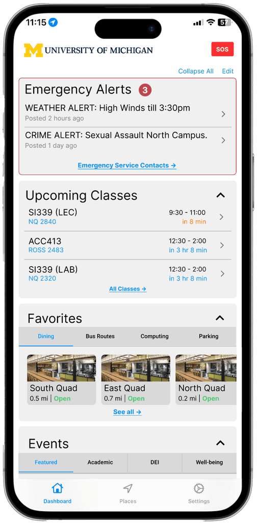
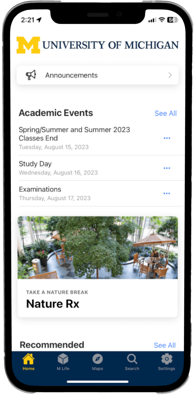
Academic Events
Class Schedule
Recommended Apps
Featured Events
News
•••
Previous home page of the Michigan App

Previous campus resources pages of the Michigan App
Based on Looker Studio analytics, the Michigan App has a total of 26,264 users. The top three accessed features are class schedules, bus information, and dining services. While students make up the majority of users, there is also notable engagement from staff and faculty.

The Michigan App analytics from Looker Studio
Project Scope
Early Scope Exploration
Based on initial context and knowledge shared by the sponsor, we explored possible directions for the project scope.
Scope Option 1 – Creating an “Everything App”
At first, we aimed to design an all-in-one app for the entire university. Many campus services were spread across separate apps, making it hard for users to find what they needed in one place. Our idea was to combine these into a single central hub.
However, we quickly realized that this approach was too ambitious. It would require a large-scale redesign and significant development resources, far beyond what our project could support.
Scope Option 2 – Fix what’s already there
We later shifted focus to a more practical direction: improving existing features. This involved evaluating and ranking the current app functions to identify which areas needed the most attention and would deliver the greatest impact.

Discovery
We started by mapping out the app’s information architecture to get a clear picture of how users move through the app and what features it includes. Then, we did a heuristic evaluation to review each feature and function. This helped us find the areas that needed the most improvement, based on how severe the usability issues were.

To confirm the issues we found and better understand the real user experience, we analyzed existing user feedback and conducted a user survey. The survey was shared with students, staff, and interns through Slack and email.
We received 30 responses (13 students, 15 staff, 2 other).

Key Insight 1
Different user roles = different needs
Students, faculty, and staff may utilize the app in varying ways, reflecting their distinct needs and engagements with the campus.
Top 3 features in importance:
Out of 13 students:
Bus (54%)
Dining (54%)
Class (46%)
Out of 15 staffs:
Parking (53%)
Bus (40%)
Featured events (40%)

Key Insight 2
The app's navigation and transportation features are dispersed across different screens
Users find it frustrating that multiple taps are needed to access bus information, as they are unable to view both the map and bus information on a single page.
Users say:
“I have no idea how the bus system works”
“Tapping on the stops doesn’t show arrival times but rather requires a separate screen”
Key Insight 3
The app has many hidden features
The app lacks a standardized structure, leading users to overlook various features and struggle to locate them.
Users say:
“The app has too many layers and is hard to access the service I want to use”
“I didn't know the app could do what the listed applications could do.”
We used an affinity diagram to organize insights from user feedback and heuristic evaluation. By grouping similar comments and observations, we identified key themes and usability patterns. One key outcome was identifying quick wins for the development team, which we marked with a gear icon to show features that could be improved with minimal effort.
Define
How Do We Prioritize Feature Fixes and Redesigns?
After identifying key issues, we used an effort-impact matrix to prioritize which features to work on during our internship. We chose to focus on items that offered high impact but required relatively low effort, ensuring meaningful improvements within a limited timeframe.

Since user needs and app structure become more important over time, it’s essential to focus on meeting those needs and simplifying the app.
Object-Oriented UX (OOUX)
Designing with Objects, Not Screens
To create a more structured and scalable experience, we applied Object-Oriented UX to identify key objects within the app, such as classes, buses, dining halls, and events. By mapping out these objects, their attributes, and relationships, we clarified what content users need and how it should be organized.
This helped us simplify navigation, reduce redundancy, and ensure consistency across the app before moving into layout and UI design.

The method helps us to understand the relationship between each of the objects as the Michigan App consists of complicated contexts. Also, during this process, we could understand the whole structure at the same time rethink of what users’ requirements and what are the information should be presented.
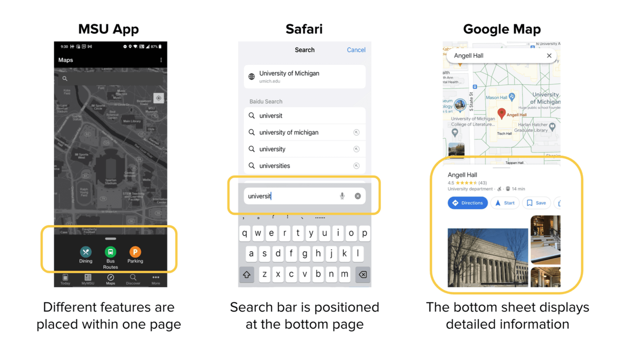
Competitor Analysis
How Do Existing App Designs Ensure Clear Information Presentation?
We analyzed how other apps organize and present information, including the M-Bus app, Penn State’s and Michigan State’s university apps. We also took inspiration from widely used apps like Safari, Google Maps, and Apple Maps to explore familiar patterns and intuitive design approaches.
Reframing Project Scope
Complex Structure Hinders User Information Retrieval
The Michigan App offers a wide array of information, including bus schedules, dining options, campus activities, and more. However, the challenge lies in the lack of a clear and standardized method for retrieving this information.
Determined Project Scope
Combine and Centralize
After going through a thorough research and analysis process, we realized that there are many individual features and currently placed as an individual element could be combined into a single category. For example, the bus, dining, parking, class locations, computing sites locations, etc are all consist of using map and navigation feature, they can be considered one category as “places”.

Final Design
The Michigan App Redesign
For the final design, we focused on three main solutions created through design sprints and brainstorm sessions. These are a modular homepage layout, an onboarding experience to guide new users, and a map-based navigation that brings location features together. Each solution addresses important usability problems we found during our research.
Home Page
We organized features into “modules” on the home page. Each module has a consistent size and design, and can be hidden, collapsed, or rearranged.

Part of the module design
Current Design
Current home page design
After Redesign (incorporate modules onto the page)
Light mode
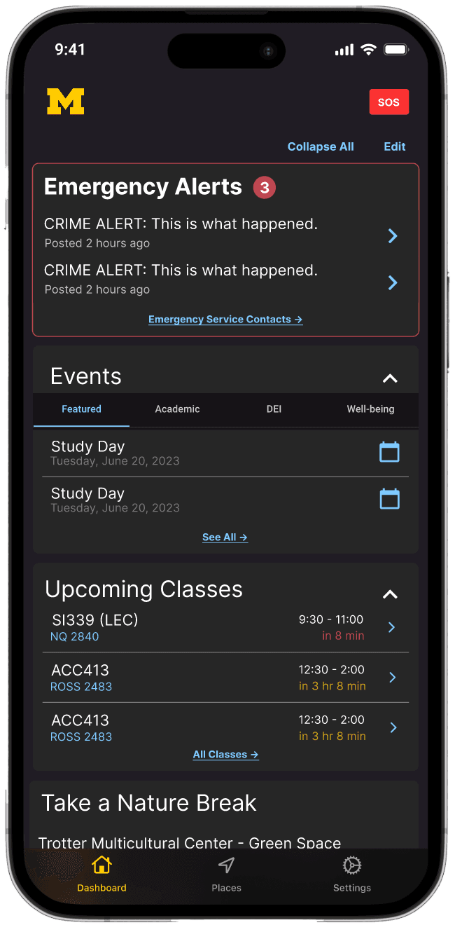
Dark mode

Home page module customization
We created an onboarding experience for first time users easily understand how the app work while helping us keep track of user roles.

The Michigan App onboarding page
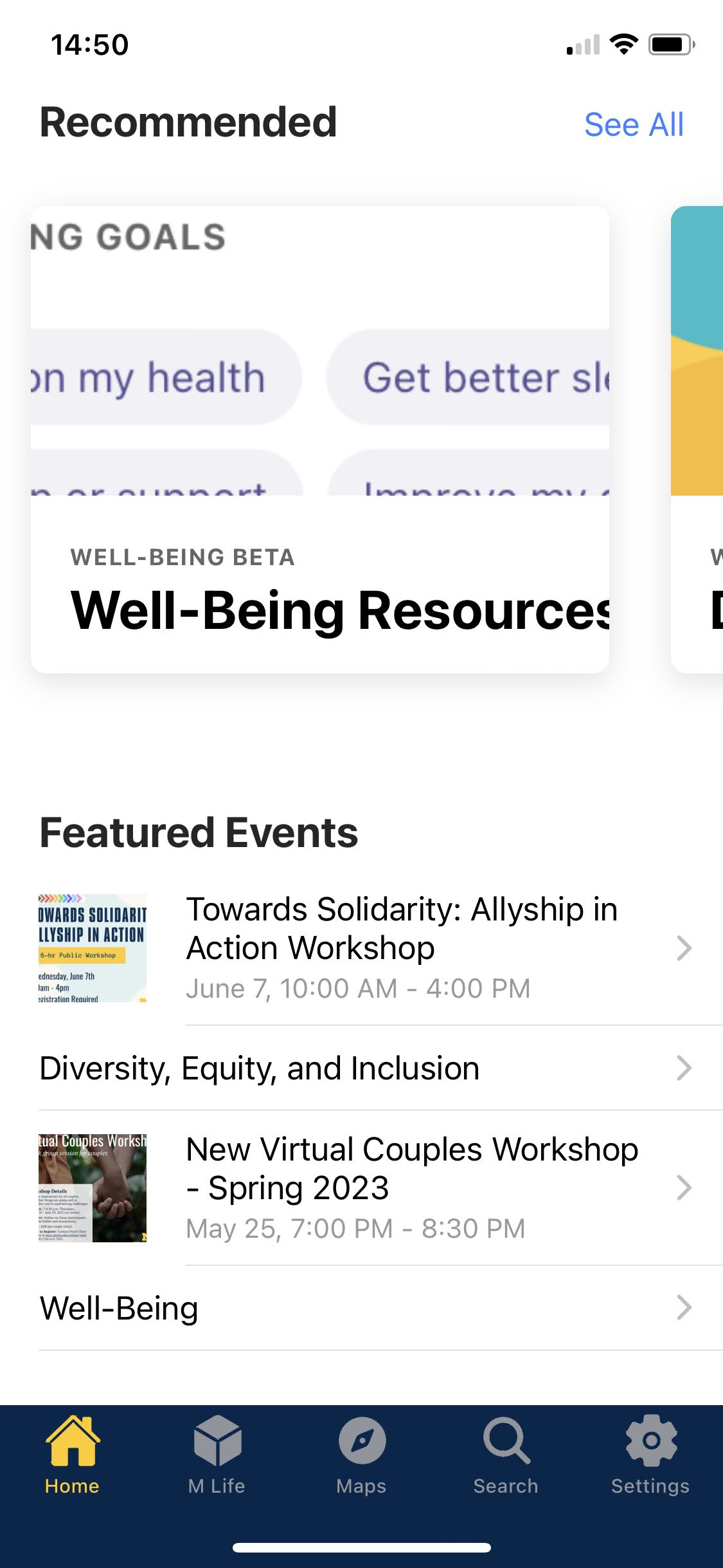
"Places" - Centralized Map Page
Another major redesign of the app functions is to combine all the location features on to a map based page. Users are able to navigate like a map page, navigating through each feature will only need to stay on this centralized map page.
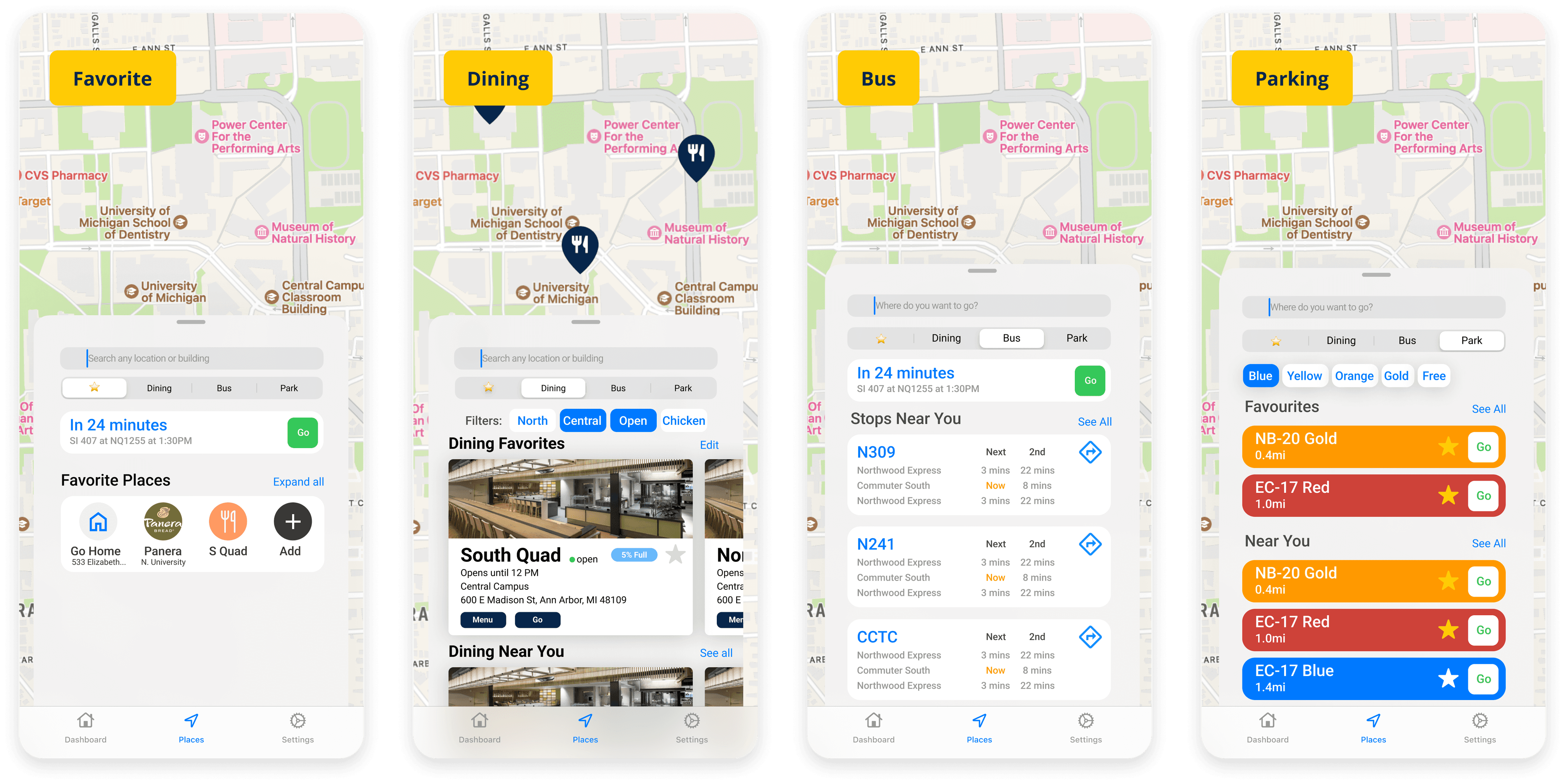
Four tabs on places page
The Places page was a key area I focused on. I explored different ways to bring all four location-based features—bus stops, dining, recreation, and parking—into one page. I experimented with various layouts, including tabs, dropdowns, and segmented controls. After testing different options, I found that a "carpet" design worked best. It allows users to switch between categories without refreshing the map, making navigation smoother and the interface easier to understand.

Initial Explorations

Strategy and Next Steps
🔨“When all you have is a hammer, everything looks like a nail.”
As passionate UXers, we understand the value of a holistic approach to product development. In addition to UX, vision, marketing, development, & more must all come together. Unfortunately, this project lacked these crucial elements. So, we took the initiative to collaborate with University of Michigan VP of IT Services, who oversees all those important areas within U-M Information and Technology Services (ITS) to plan for:
People and resources needed to keep the app aligned with user needs (research)
How the app can act as a vessel for the university’s larger goals (eg. Climate action, DEI)
Lessons Learned
Define Project Scope Early. In our project, the lack of a set project scope meant spending a lot of time exploring the app and conducting research to decide our focus. Our broad initial idea made it challenging to complete tasks within the given timeframe. Having a clear project scope from the start is essential to prevent scope creep and stay focused on achievable goals.
Consider Developer Capabilities. Engaging in conversations with developers proved invaluable in this project, as they helped filter out impractical suggestions and provided insights into the development team's capabilities based on their past experiences.
Prioritize Effective Communication. Our team excels in effective communication, a vital element for success. It is imperative to maintain alignment among team members and stakeholders regarding goals, timelines, and progress.

Our lovely team : )
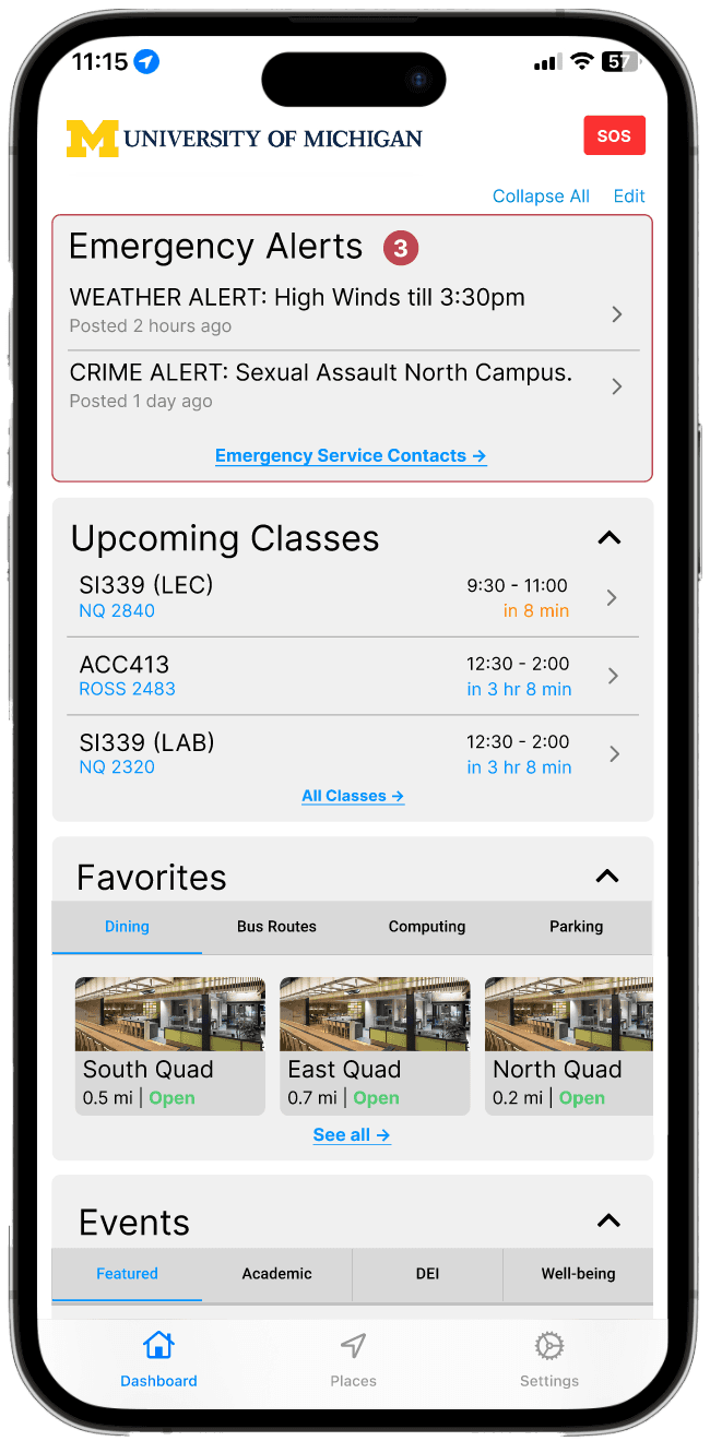
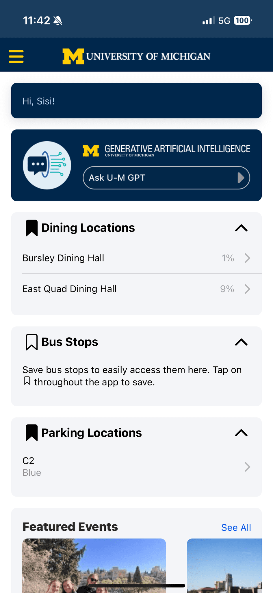
The Michigan App Today
Design Solutions Adopted by the University
After completing the redesign, we presented our work to the Michigan App development team and university stakeholders. Several of our proposed solutions, including the modular homepage and map-based navigation, were approved for implementation.
As of 2025, many of these designs have been integrated into the live Michigan App, improving usability for more than 26,000 users. The current interface reflects key decisions and design strategies from our project.
The university applied our modular homepage design, making key features easier to access and the layout more user-friendly.

The university adopted our carpet-style layout, allowing users to view different locations without leaving the map screen.

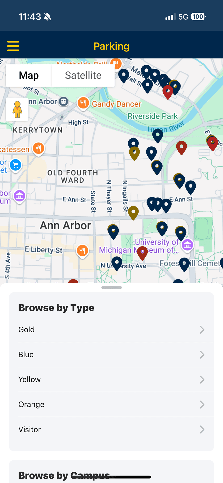
The updated app groups features like bus, dining, and parking into a clearer navigation menu, making it easier for users to find what they need.


The Chery Industrial E-Commerce Website Redesign
Redesigned the Chery Industrial site to build user trust and make internal workflows smoother, increasing conversion rates by 25% and reducing product update time by 40%.

VitaSync: WebVR Research Recruitment Platform
Designed an immersive WebVR platform that streamlines bioscience research recruitment by clearly presenting study goals and procedures.

Avenue Redesign for Immigrants Language Learning
Improved website visual clarity to help adult immigrants from underserved and conflict-affected regions access language learning resources.