
Overview
Redesigning Language Learning for Newcomers Rebuilding Their Lives
Avenue is a language training platform designed under The LearnIT2teach Project providing training for language educators in supporting new adult immigrants to Canada. Avenue aims to provide learners with the skills and knowledge they need to effectively communicate and integrate into Canadian society. With Avenue, learners can access language training anytime, anywhere, and at their own pace, making it an ideal solution for busy learners who need flexibility and convenience.
Why This Redesign?
The redesign is motivated by the current website's presentation of abundant information and resources without a clear information architecture. This leads to user frustration, particularly for new immigrants from underrepresented communities with limited technical skills.
Timeframe
My Role
Team
Project Link
Key Results
• Conducted design critiques to understand the site’s usability issues
• Redesigned 12 pages of the Avenue website for clarity and accessibility
• Created a style guide with a new, warmer color palette to improve readability and engagement
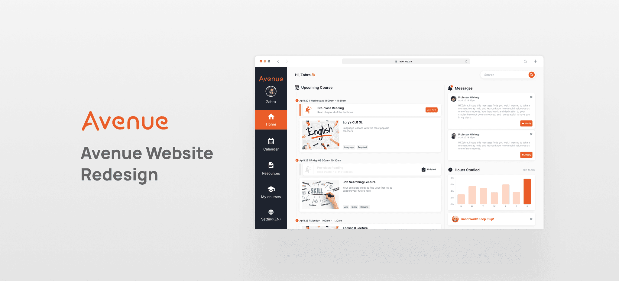
Quick Look
Before & After
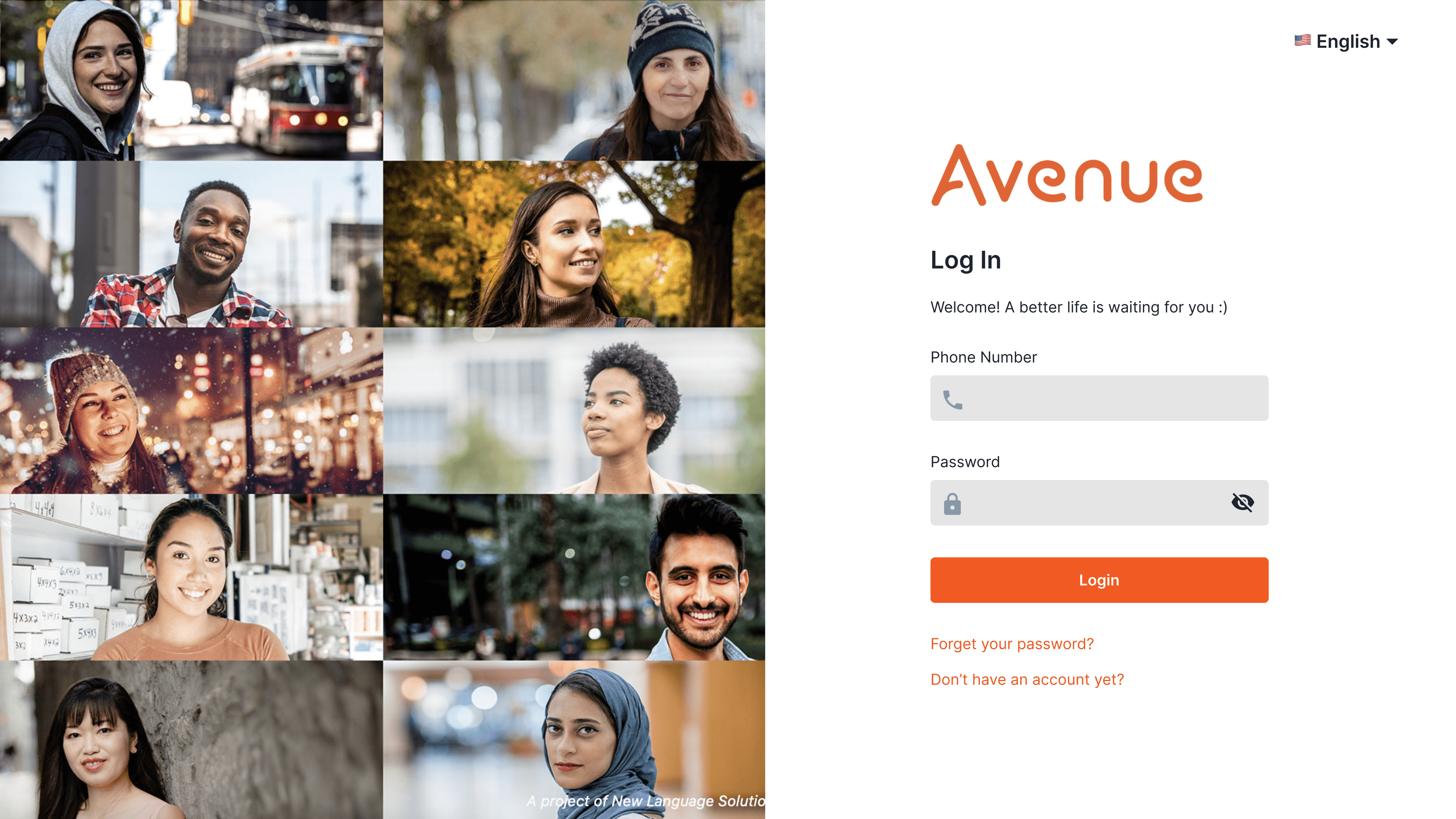
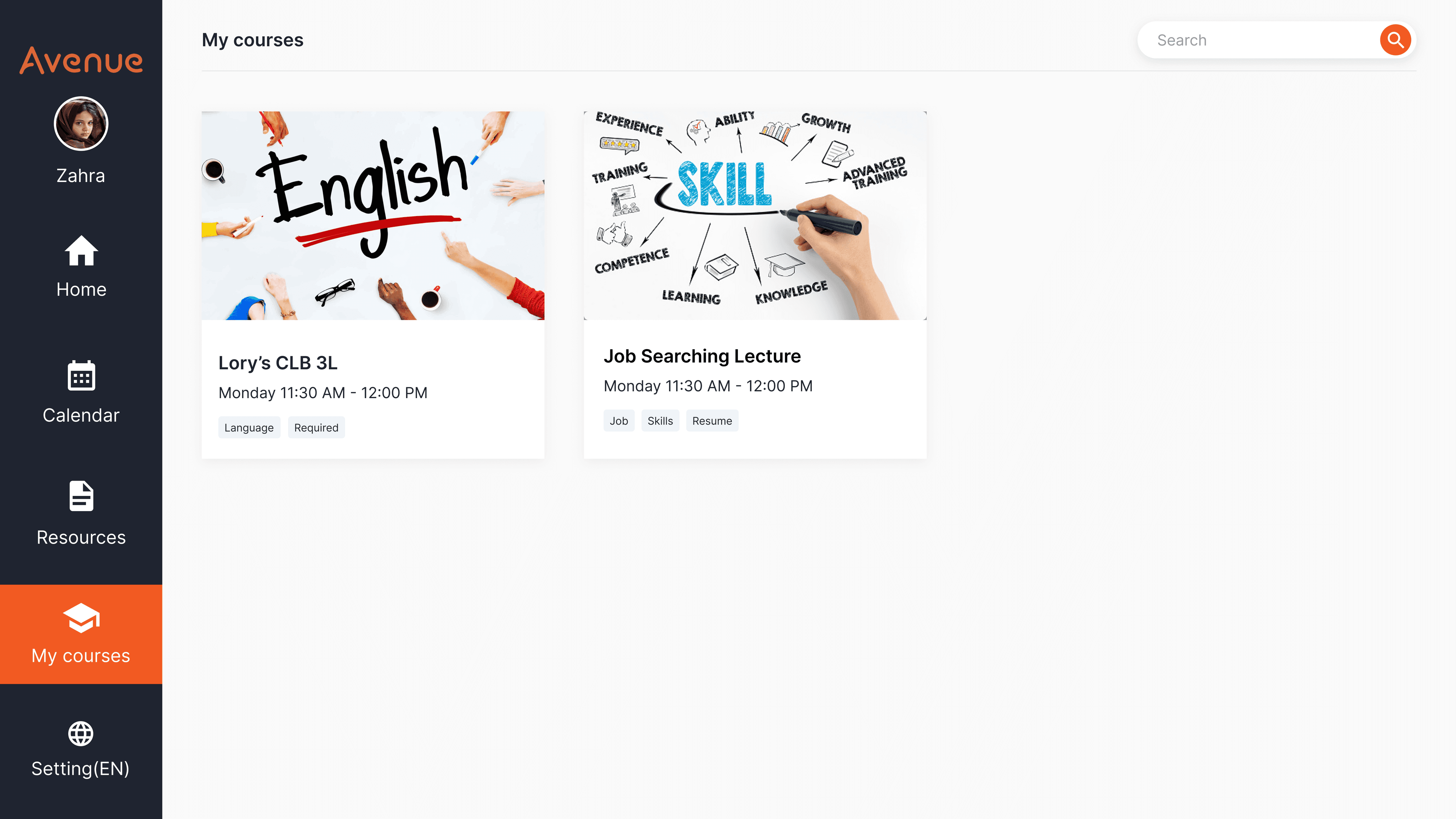
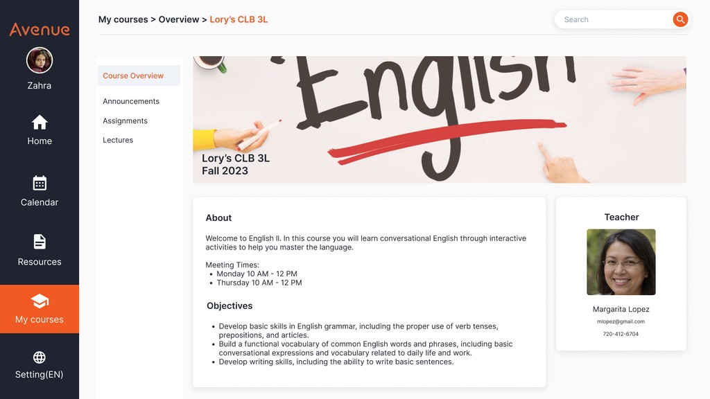
Existing Design

Redesign


Persona
Getting to Know Our Users
Before starting the redesign, I conducted a competitive analysis and compared the websites of other educational learning website to Avenue’s current website.

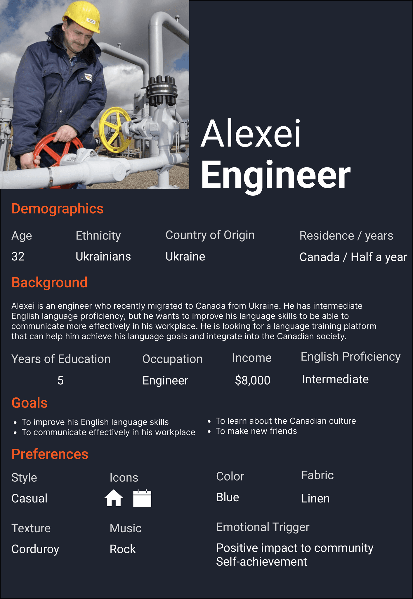
The personas helped me identify that the website’s users have different levels of education, from low to medium literacy, and often come from underserved regions or places affected by conflict. As newcomers, they need a clear, easy-to-use platform with a warm and welcoming tone.
Design Research
Competitive Analysis
Before starting the redesign, I conducted a competitive analysis and compared the websites of other educational learning website to Avenue’s current website.
Avenue's current website:

Screenshots of other educational learning website:


Looking at competitor examples, a few patterns stand out…
Clear Visual Hierarchy
Many educational learning websites use a clear visual hierarchy, dividing content into distinct modules for different purposes. For example, learning progress, class information, and teacher introductions. On Avenue’s website, this hierarchy is missing, making it difficult for users to understand what’s most important and how to navigate the content effectively.
Clear Calls-to-Action
Other websites also make use of clear calls-to-action (CTAs) and buttons, highlighting the areas learners are most likely to click. Avenue’s current design lacks this clarity, which may cause users to overlook important actions and reduce engagement.
Design Critique
Pain Point #1
Inconsistent Layout
The Avenue website uses many inconsistent layouts which shows there is no standard design system. Without consistency some pages appear random and disconnected and this makes it harder for users to navigate and understand the site.
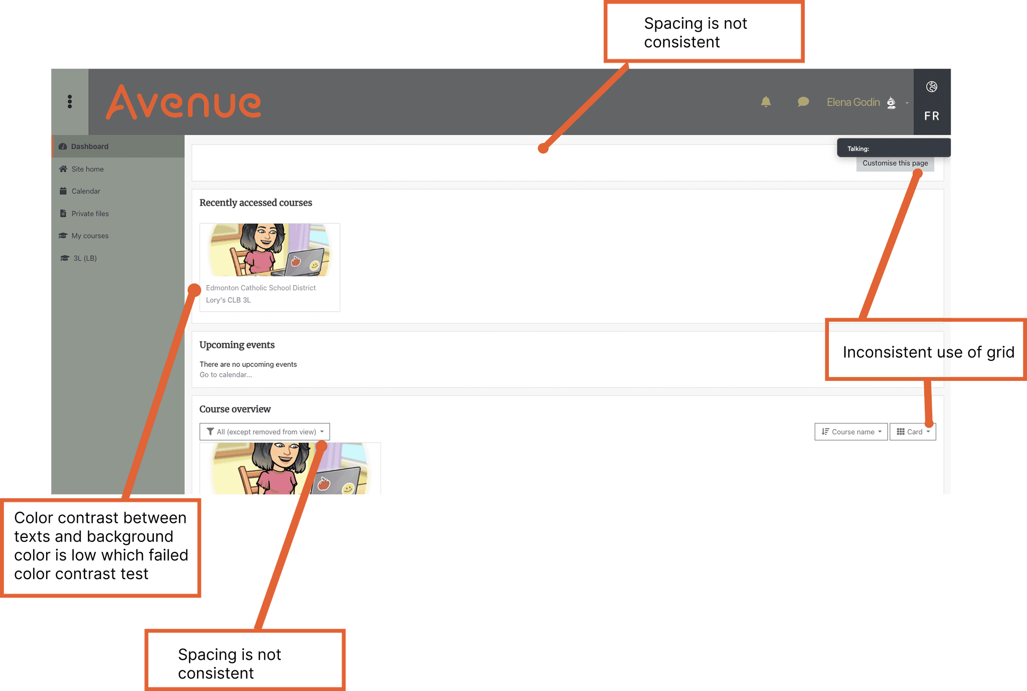


Pain Point #2
Failed Color Contrast Test
The Avenue website uses low-contrast color combinations that fail accessibility tests, making content harder to read for many users.

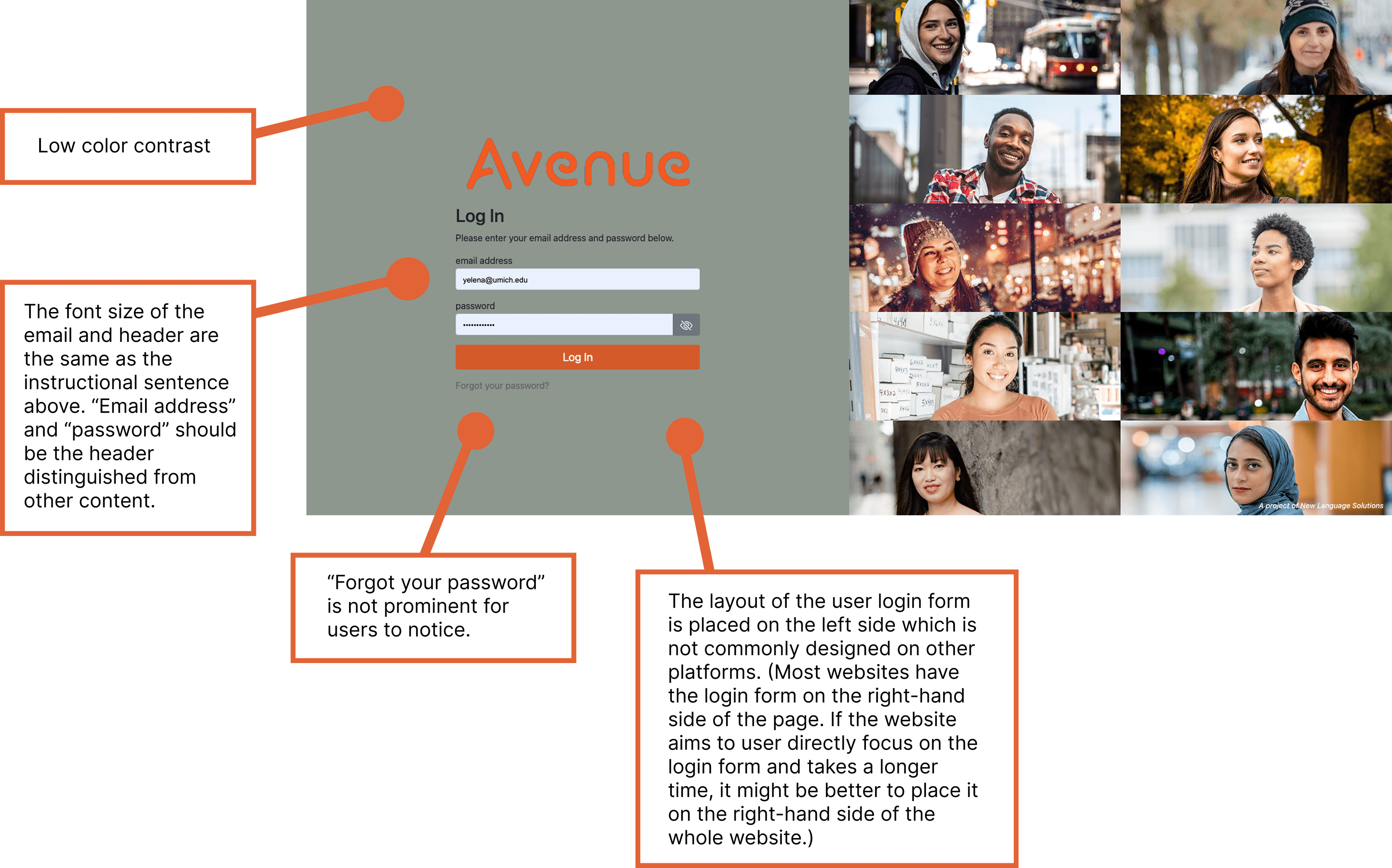
Pain Point #3
Information and Options Overload
The website shows a lot of information and options on each page which can overwhelm users and make it hard to focus and decide what to do next.

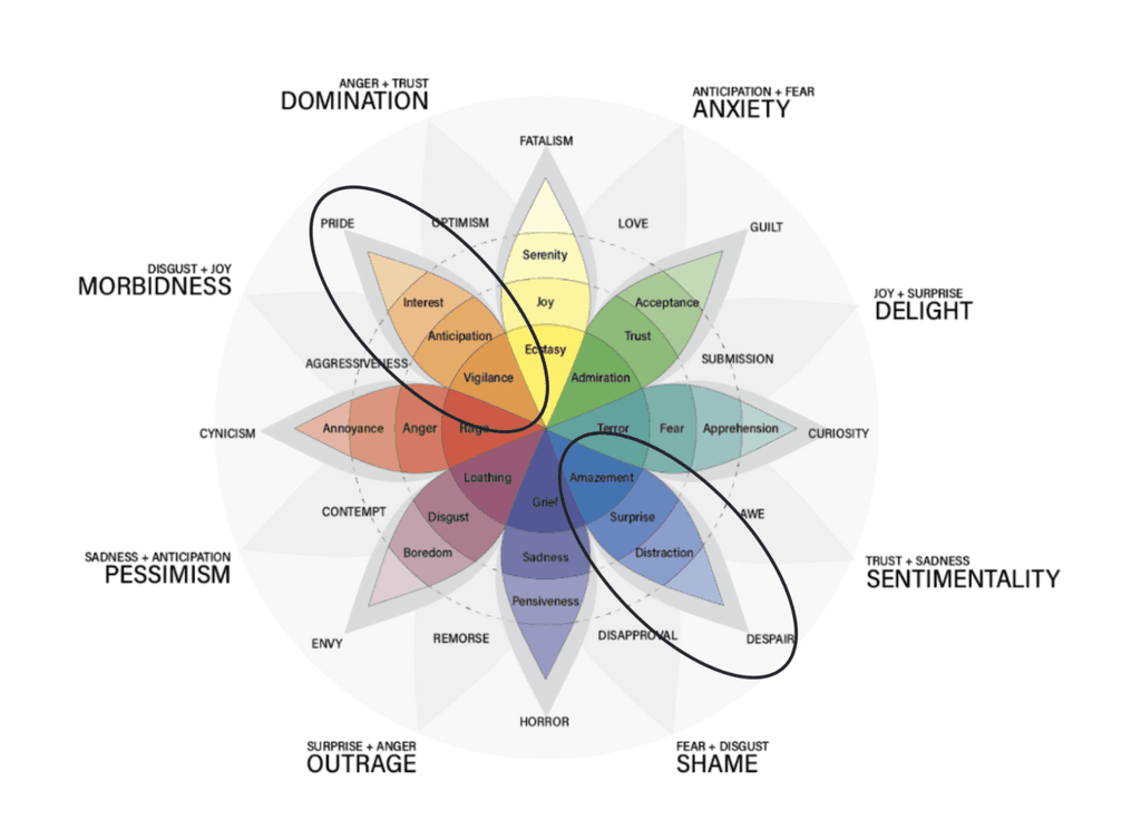
Emotional Response
Creating a Warm, Welcoming Experience
Our goal is to create an emotional response in users that is warm, hopeful, and trustworthy. To achieve this, we have chosen to use a warm color palette that conveys a sense of approachability and friendliness. Through the use of warm colors such as red, orange, and yellow, we hope to evoke feelings of joy and acceptance in users of the platform. By creating a welcoming and positive environment, we aim to make users feel comfortable and engaged with the learning process.
New Color Palette
Therefore, we came up with our new color palette.
Keywords: welcoming, hopeful, warm, trustworthy

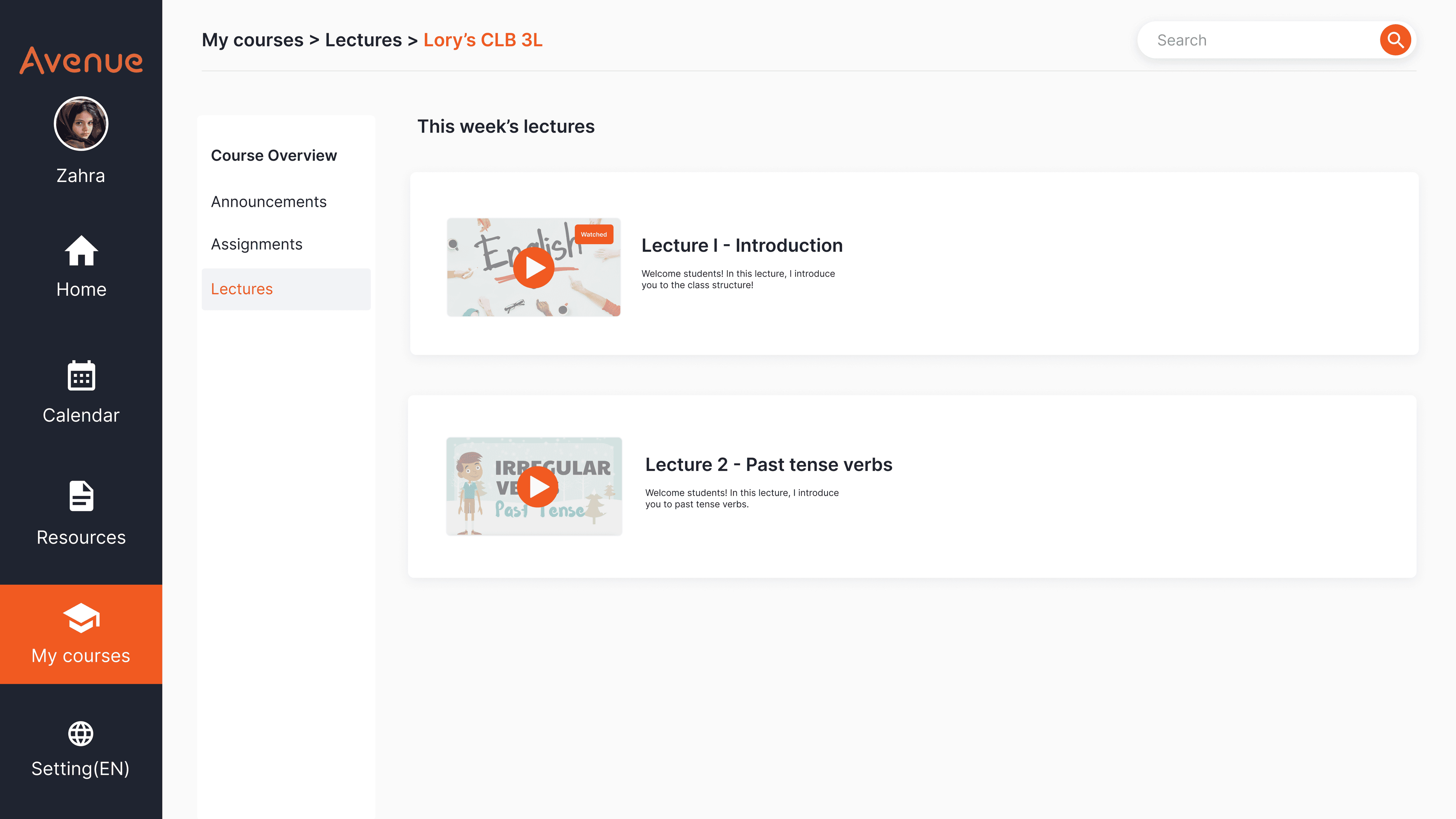
Final Design
Key Screens
The final design uses a clear and consistent layout that fixes the issues we found. It also brings in a warm color palette to make the site welcoming for newcomers, especially those from underserved communities and places affected by conflict. The simpler structure and easy navigation help users with limited technical skills use the platform with confidence.


Style Guide
Ensuring Design Consistency


The Michigan App Redesign: Sustaining User Engagement
Redesigned the Michigan App to support diverse campus needs, simplifying key flows to reduce developer costs and improve user retention.

The Chery Industrial E-Commerce Website Redesign
Redesigned the Chery Industrial site to build user trust and make internal workflows smoother, increasing conversion rates by 25% and reducing product update time by 40%.

VitaSync: WebVR Research Recruitment Platform
Designed an immersive WebVR platform that streamlines bioscience research recruitment by clearly presenting study goals and procedures.