

Overview
Pioneering Industrial E-commerce
Chery Industrial was one of the first in its industry to let customers buy large equipment fully online without needing to call. But as the company grew, sales started to slow down, and the website no longer matched its expanding presence.
I joined as the sole UX designer to help refresh the site and support the company’s push to modernize its online experience.
Timeframe
My Role
Team
Project Link
Key Results
• Improved product clarity with structured layouts and consistent content
• Reduced trust-related support calls by surfacing key information on the homepage
• Launched a modular homepage and content system, now live on the Chery Industrial website (2025)


Problem & Goal
Trust and Clarity Were Missing
Customers were unsure about placing large orders because the website didn’t feel trustworthy. Many called to check if the company was real or to ask basic questions, which showed that key details and trust signals were missing. Inside the company, the support team kept getting the same questions that better product info and design could have answered.
The goal was to redesign the site to build trust, make product information easier to understand, and help customers feel confident enough to shop without needing extra support.
Missing Brand Identity and Clarity
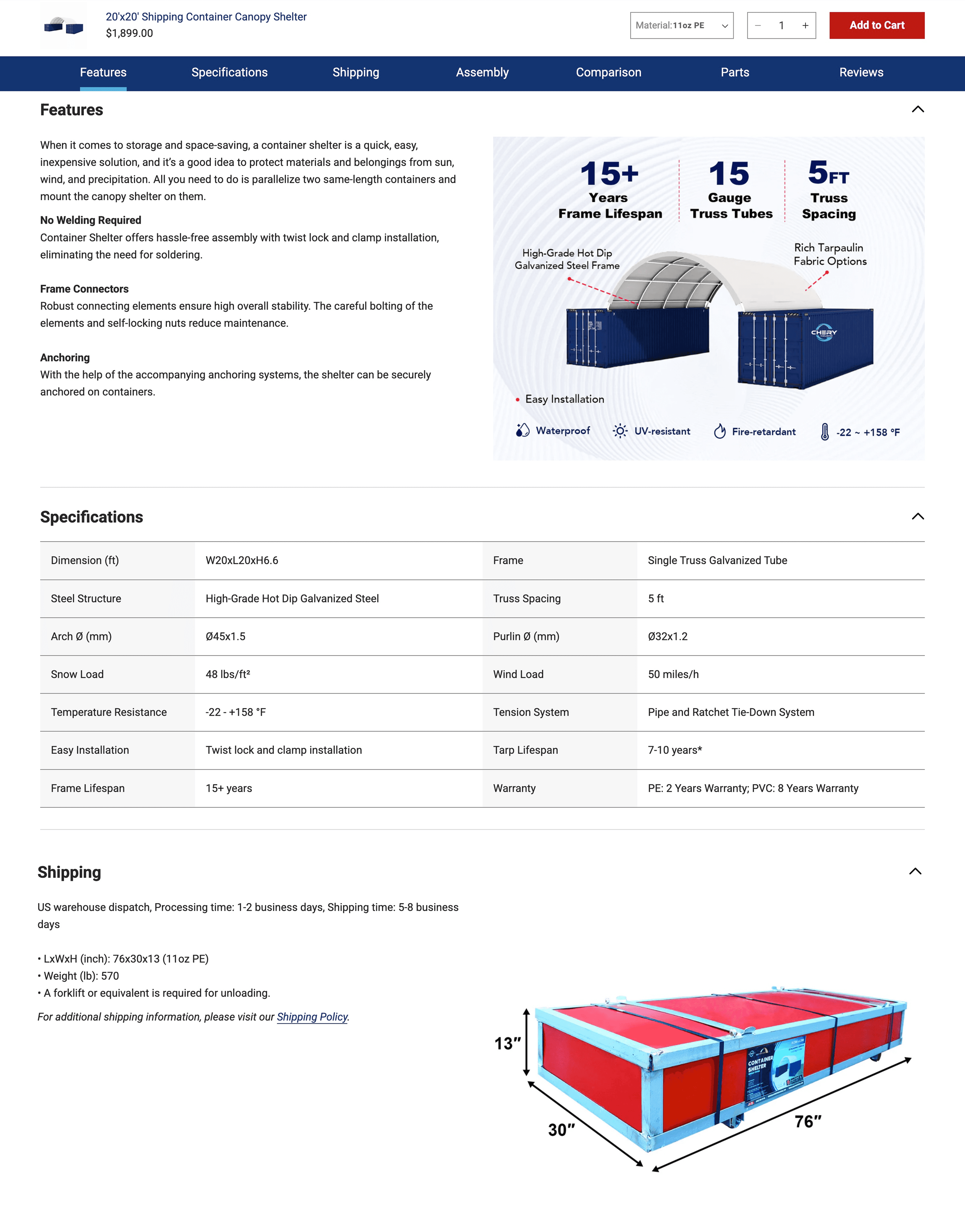
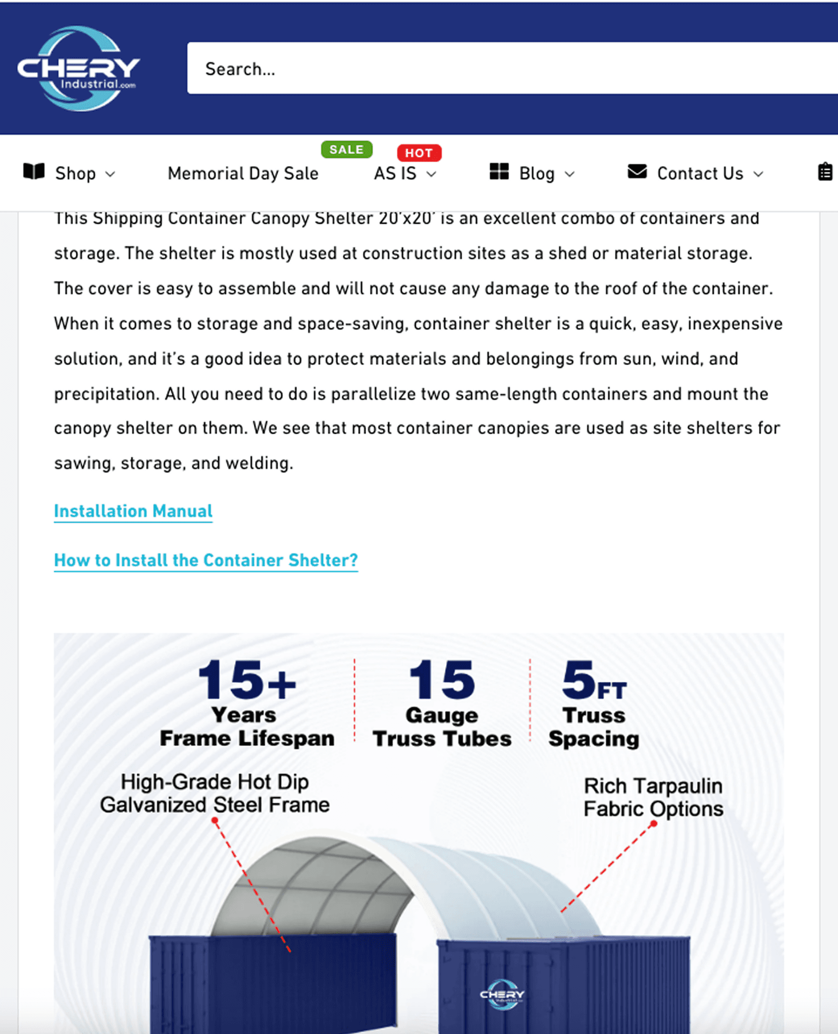
The original website relied heavily on a generic Shopify template and lacked a clear brand identity. The vague content and minimal design made the site feel untrustworthy, causing users to hesitate before making high-value purchases.

Original website built with a standard Shopify theme
The Approach
Collaborative Learning Across Teams and Users

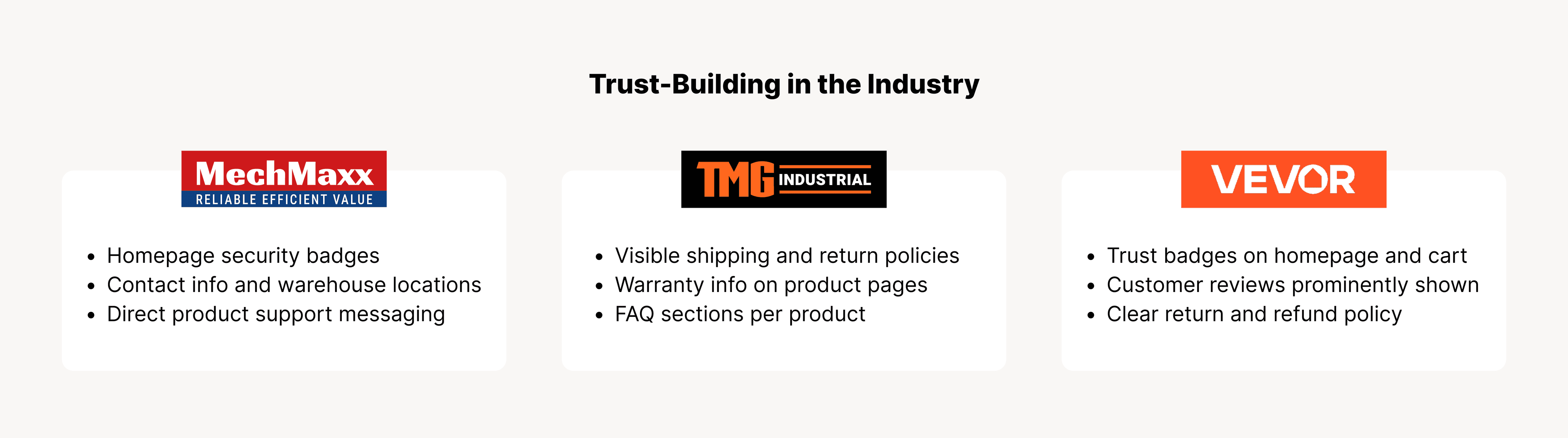
Competitor Analysis
Deep Dive into the Industry Landscape
To complement internal discovery, I also conducted in-depth competitive analysis. I examined how similar brands in the industrial and direct-to-consumer space handled product complexity, visual clarity, and transparency in policies. This included reviewing how product specifications were structured, how users interacted with images, and how shipping details and return policies were communicated.
This research showed a clear trend: brands were increasingly investing in trust-building elements throughout the shopping experience to support confident, self-service purchasing.
Discovery
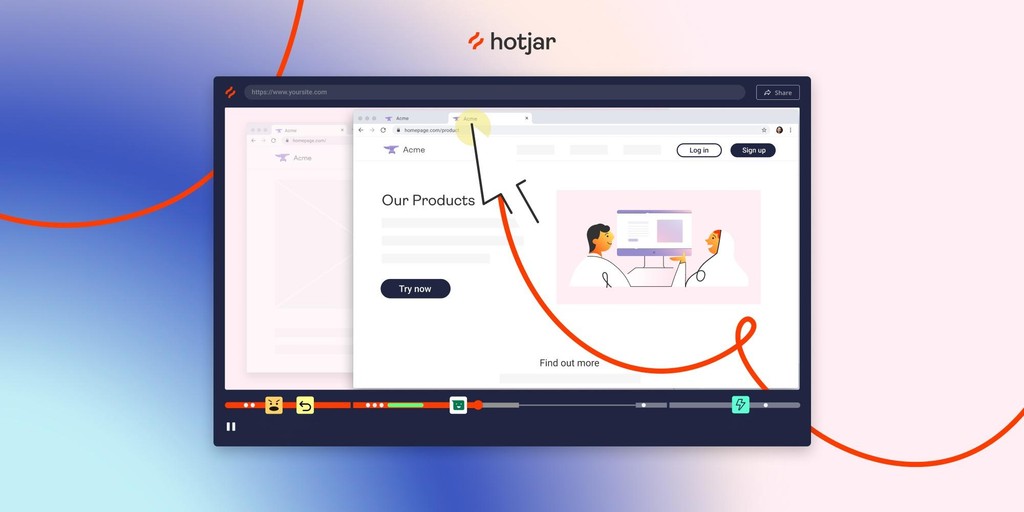
Users Needed Confidence; Teams Needed Clarity
Hotjar recordings showed that users frequently visited the About page, often after adding items to the cart, as they looked for more information about the company. This revealed that trust, not just visual design, was the main barrier. The website felt generic, product details were unclear, and purchase terms were hard to find. Many customers contacted support to confirm basic information before placing high-value orders.
Inside the company, each team managed product content differently. This caused inconsistencies, confusion, and slow updates. To support self-service purchasing, we needed more than a visual refresh. We needed a clear system that built trust and worked well across teams.
Design & Implementation
Fast-Track Design & Build
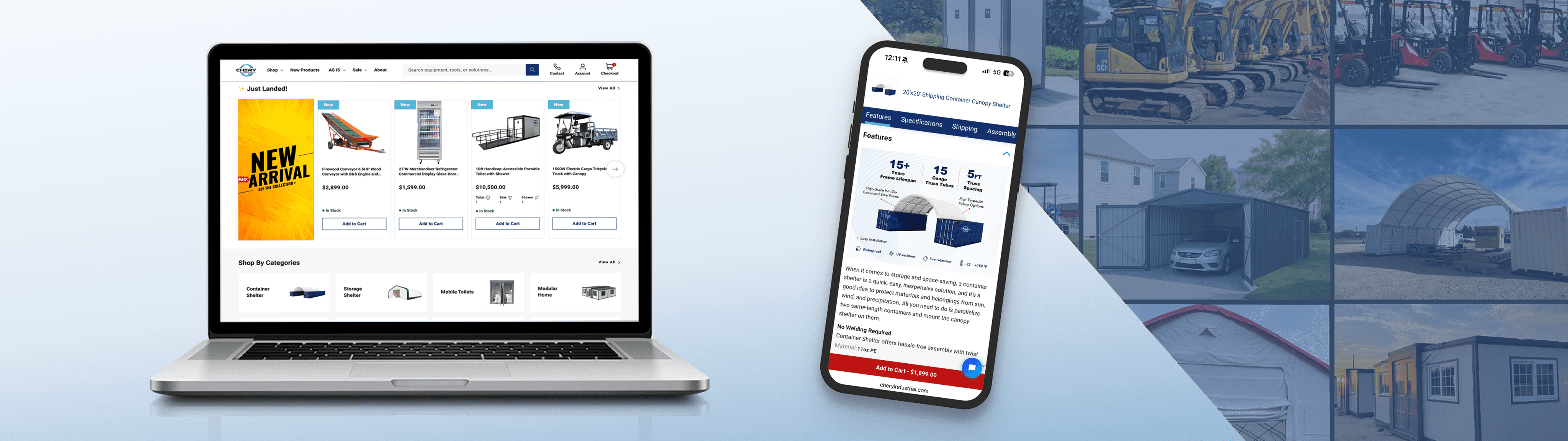
This project moved quickly, with design and development running in parallel. I created initial drafts of each page, shared them with the manager for feedback, and handed off finalized Figma files to developers while simultaneously designing the next page.
We prioritized key customer-facing pages—product, collection, and homepage—since many users landed directly on product pages through ads or search. These pages were critical for building trust and driving conversions.
Once those were completed, I moved on to supporting pages such as checkout, blog, about us, warehouse locations, and terms. The workflow was highly iterative, with frequent adjustments made even after development started. Thanks to the modular design system I built, changes were quick and efficient for developers to implement.

Decision Making
The Chery Industrial E-Commerce Website Redesign
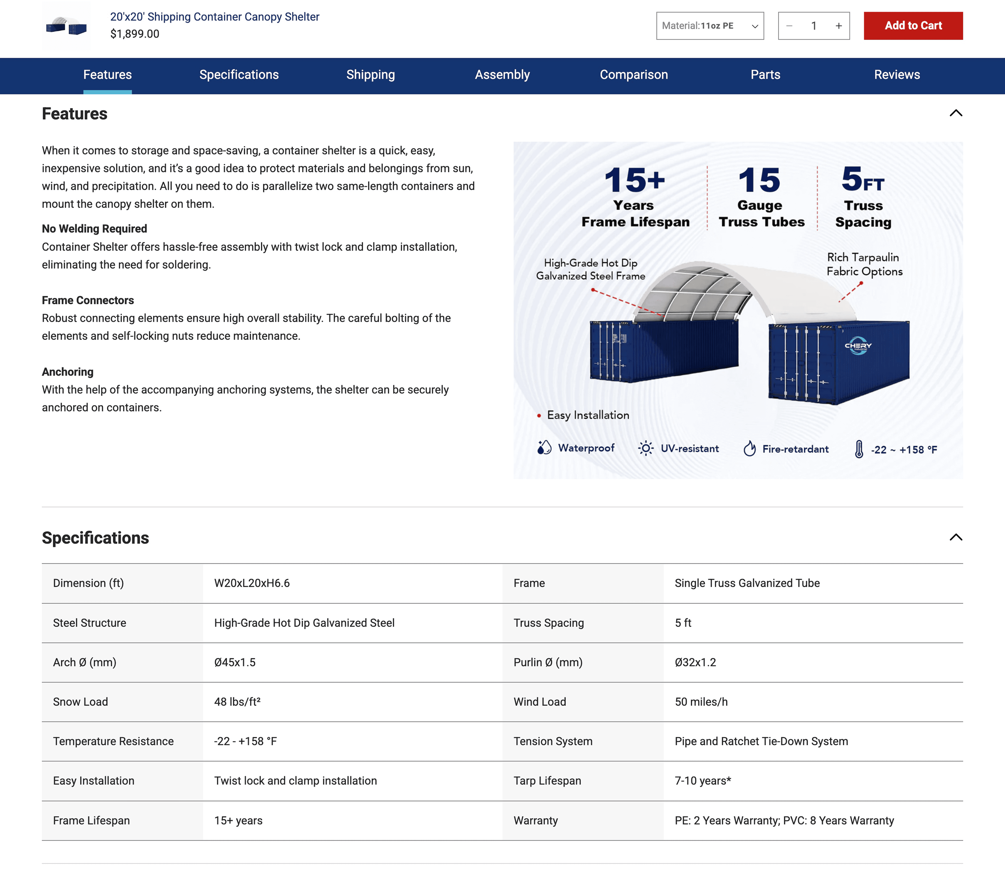
Below are key design decisions I made to address the core pain points identified throughout the research and design process, from user behavior insights to internal team feedback. Each decision was aimed at improving trust, product clarity, and the overall user experience.

Client logo scroller

Trust badges


Standard left-text, right-image block
Desktop
Mobile

Modular content for easy editing and layout control
Before
After
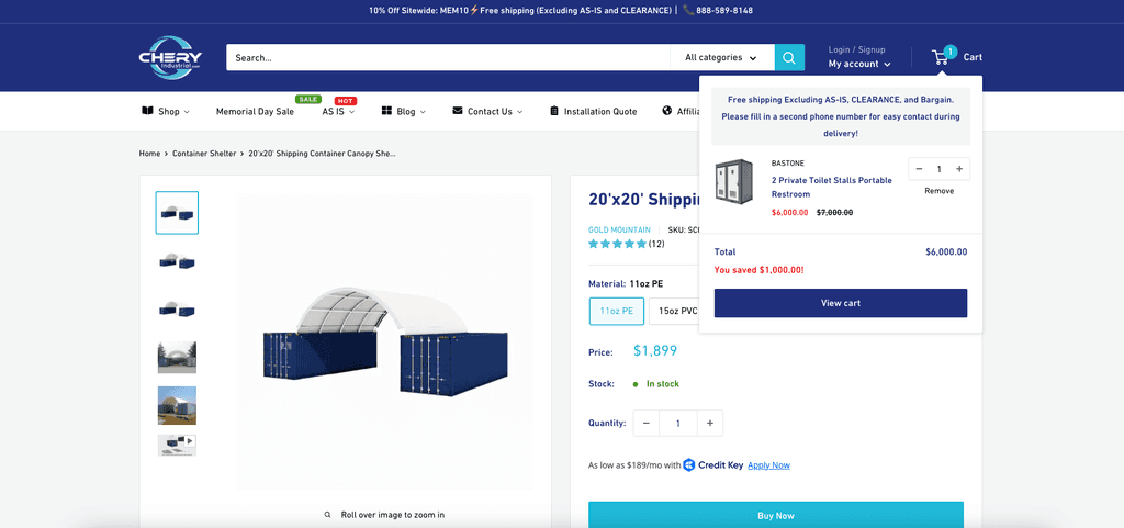
Improve Transparency in Purchase Terms,
clearly layout the text page section
Purchase terms shown near checkout

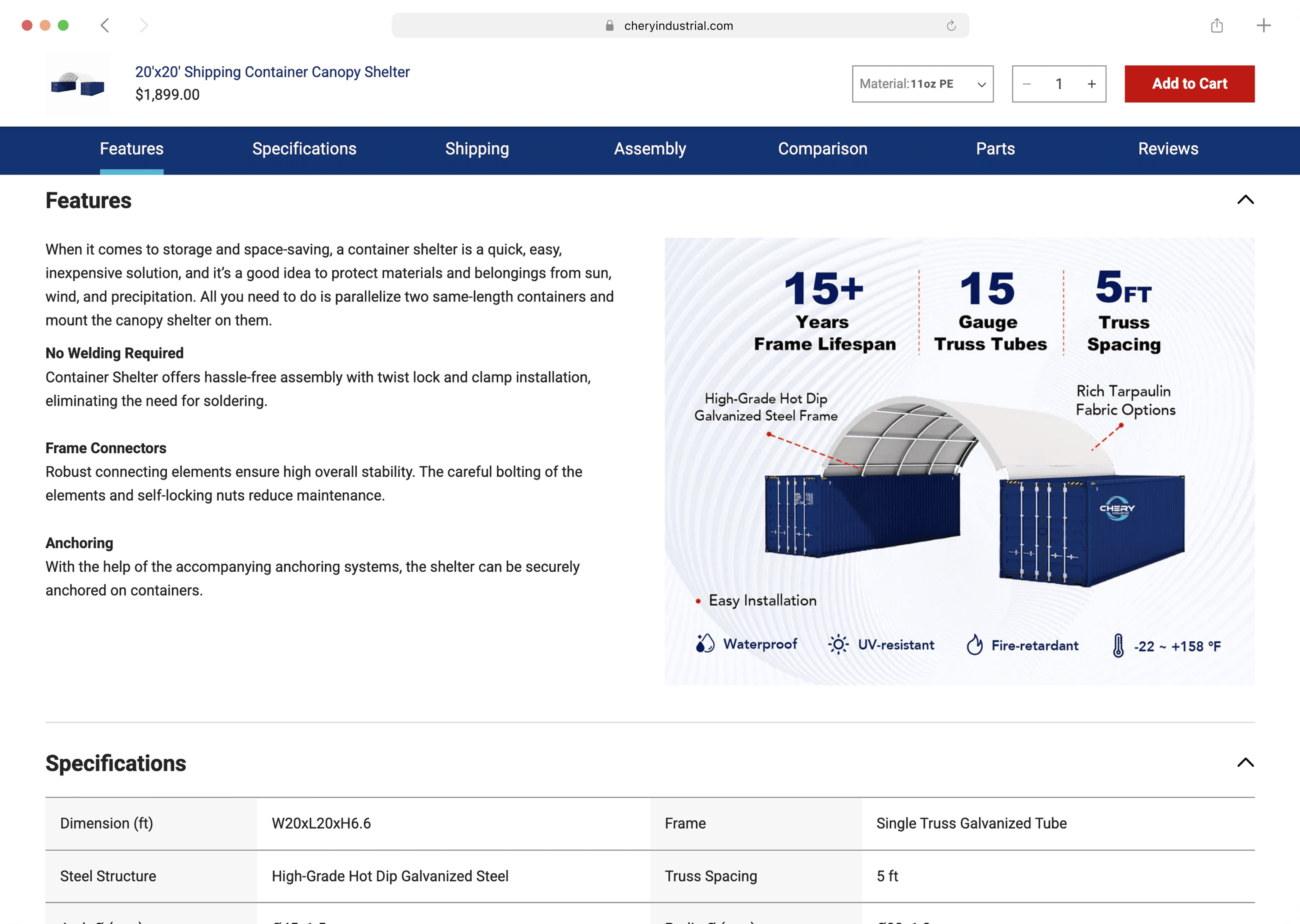
Key decision-making info added to product page
Design System
Building a Scalable Design System
To move away from the limitations of a generic Shopify theme, I created a custom design system from the ground up. The previous site lacked a strong brand identity, with mismatched colors and fonts that didn’t reflect the company's industrial focus.
The new system introduced consistent styles and a clear visual language. It supported our current redesign and set a solid foundation for faster and more unified design updates in the future.

The Impact
Increased Conversion Rate by 25% and Boosted Overall Site Performance
Within just two months of launch, the redesigned website has shown clear improvements in customer experience, operational efficiency, and search visibility:
✅ 40% faster product update time using a modular content system
✅ Fewer support calls due to clearer product info and on-site FAQs
✅ Improved SEO performance and content visibility across key product and policy pages
✅ Positive internal feedback: teams across operations and customer service noted the clearer structure and easier site management
Lessons Learned
Paying Attention to Small Details Makes a Big Difference
This was my first time working on a real-world website redesign from start to finish. I quickly learned that even small design decisions could affect many areas of the business. For example, we used transparent product images because they looked clean on the site, but we later found that these caused issues in Google Ads, as the image background appeared black and made the products look off.
I also noticed how every small detail on the product page matters. If one item, like shipping time or included accessories, is unclear, customers would call to ask. This not only slowed them down but also created more work for our support team.
This experience taught me to ask more questions early, involve different teams, and think about how each design decision might affect marketing, sales, and operations. It reminded me that UX is not just about design, it’s about clear communication and smooth collaboration too. This project underscored the power of UX-informed content systems. It reinforced that content clarity, policy transparency, and visual consistency are as important as visual aesthetics. Effective collaboration across departments helped translate internal challenges into actionable user-facing improvements.

The Michigan App Redesign: Sustaining User Engagement
Redesigned the Michigan App to support diverse campus needs, simplifying key flows to reduce developer costs and improve user retention.

VitaSync: WebVR Research Recruitment Platform
Designed an immersive WebVR platform that streamlines bioscience research recruitment by clearly presenting study goals and procedures.

Avenue Redesign for Immigrants Language Learning
Improved website visual clarity to help adult immigrants from underserved and conflict-affected regions access language learning resources.