
TIMEFRAME
Feb - May 2025
UX Designer (Solo)
Content Designer
ROLE
TYPE
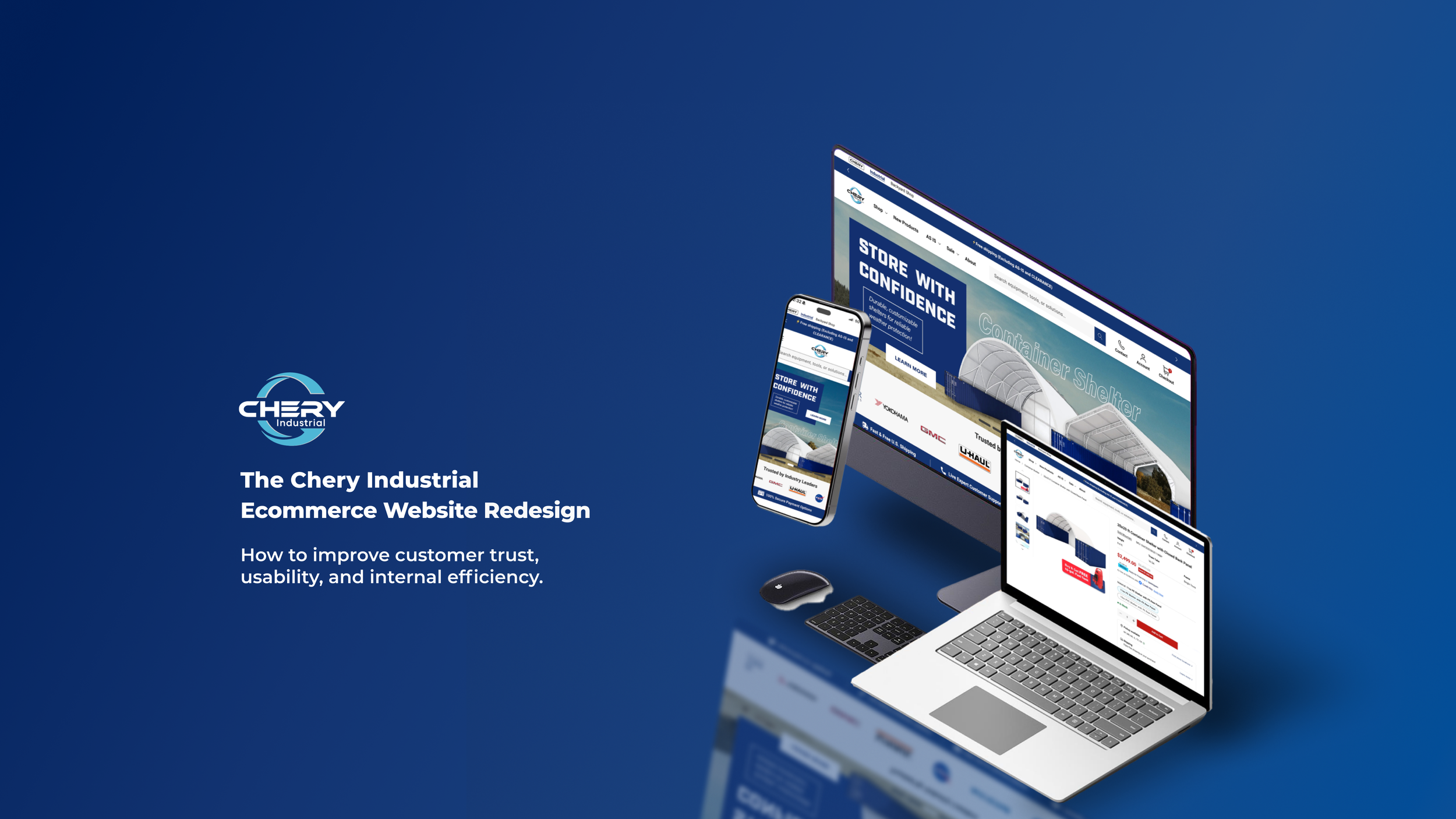
Ecommerce Website Design
LINK
Chery Industrial was one of the first in its industry to let customers buy large equipment online, no calls required. However, as the company expanded, sales growth began to stall and the website no longer reflected its evolving presence.
I joined the project to help redesign the website as part of the company’s effort to modernize its growing online presence.
Pioneering Industrial Ecommerce

The Challenge
Clarifying a High-Stakes Purchase Experience
The redesign began when a manager approached me with concerns about customers frequently calling to confirm if the company was legitimate, especially given the high value of the products.
This lack of buyer confidence revealed broader operational challenges and inconsistencies in how product information was presented and maintained.
Over a focused 3.5-month timeline, I led the redesign from research to launch, balancing user trust and clarity with internal efficiency.
“I just want to make sure this company is real before I place a $5,000 order.”
“We get the same questions every day, customers don’t trust the site enough to check out without calling us first.”
The Approach
Collaborative Learning Across Teams and Users
When I joined the project, I didn’t fully understand how each department was involved in the website or what problems they were facing. To learn more, I spoke with team members from customer service, product, operations, and advertising. I started by having them walk me through their day-to-day work before asking questions to understand their specific challenges.
Throughout the project, I also tracked backend site data and user behavior to identify issues through heuristic evaluation.
To understand our customers directly, I worked closely with the customer service team to gather frequent buyer questions and concerns. This helped me identify key areas where users lacked trust in the site.

Deep Dive into the Industry Landscape
To complement internal discovery, I also conducted in-depth competitive analysis. I examined how similar brands in the industrial and direct-to-consumer space handled product complexity, visual clarity, and transparency in policies. This included reviewing how product specifications were structured, how users interacted with images, and how shipping details and return policies were communicated.
This research showed a clear trend: brands were increasingly investing in trust-building elements throughout the shopping experience to support confident, self-service purchasing.

The Discovery
Users Needed Confidence; Teams Needed Clarity
Discovery showed that trust—not design—was the core issue. Customers hesitated to place high-value orders because the website felt generic, lacked clear product details, and didn’t explain purchase terms well. Many called customer service to confirm basic information.
Internally, each team had its own process for product content, which led to misalignment, inconsistent details, and slow updates.
To truly support self-service purchasing, we needed more than visual polish. We needed a unified system that built customer confidence and worked smoothly across teams.
Decision Making
Introducing Chery Industrial’s updated e-commerce site with a clearer brand presence, easier-to-navigate product information, and stronger cues for customer trust based on buyer concerns and internal feedback.
1 Build Trust Through Authentic Branding
Why:
Customers hesitated to trust the brand due to a generic theme and lack of recognizable visual anchors. We prioritized first-impression confidence.
What I Did:
Added client logo scroller and security badges to the homepage to build immediate trust and show legitimacy to new visitors

Client logo scroller

Trust badges
Created a new About page highlighting U.S. warehouses, company history, and credibility points


Newly created about us page
Introduced official brand colors, typography, and iconography across all templates


Website design system
Result:
Fewer inquiries about company legitimacy
Increased confidence to purchase
2 Modularize Product Pages for Clarity
Why:
Manual product creation led to errors, delays, and a disjointed buyer experience. A modular system created flexibility and repeatability.

What I Did:
Audited content structures across SKUs and created standardized content blocks
Standard left-text, right-image block
Designed a modular product page template allowing easy toggle of sections (e.g., specs, shipping, FAQ, visuals)


Modular content for easy editing and layout control
Result:
Product update time reduced by 40%
Layout clarity improved significantly

Old design presented content in a dense, unstructured format

New design features structured, modular content for improved readability
3 Improve Transparency in Purchase Terms, clearly layout the text page section
Why:
Surprise cancellation or restocking fees created customer frustration. We surfaced the terms early in the journey.
What I Did:
Drafted a “Know Before You Buy” module with bullet-point summaries of purchase policies

Purchase terms shown near checkout
Added key shopping info to product page for early customer visibility

Key decision-making info added to product page
Reduced refund disputes
Customers better informed before purchasing
Result:
The Impact
Increased Conversion Rate by 25% and Boosted Overall Site Performance
Since launch, the redesigned website has driven measurable results across customer experience, operations, and search visibility:
✅ 40% faster product update time using a modular content system
✅ Fewer support calls due to clearer product info and on-site FAQs
✅ Improved SEO performance and content visibility across key product and policy pages
✅ Positive internal feedback: teams across operations and customer service noted the clearer structure and easier site management
While the tracking period has been relatively short, early indicators are strong. Long-term results will continue to surface as the site scales.
Lessons Learned
Paying Attention to Small Details Makes a Big Difference
This was my first time working on a real-world website redesign from start to finish. I quickly learned that even small design decisions could affect many areas of the business. For example, we used transparent product images because they looked clean on the site, but we later found that these caused issues in Google Ads — where the background appeared black, making the products look off.
I also noticed how every small detail on the product page matters. If one item, like shipping time or included accessories, is unclear, customers would call to ask. This not only slowed them down but also created more work for our support team.
This experience taught me to ask more questions early, involve different teams, and think about how each design decision might affect marketing, sales, and operations. It reminded me that UX is not just about design — it’s about clear communication and smooth collaboration too.This project underscored the power of UX-informed content systems. It reinforced that content clarity, policy transparency, and visual consistency are as important as visual aesthetics. Effective collaboration across departments helped translate internal challenges into actionable user-facing improvements.